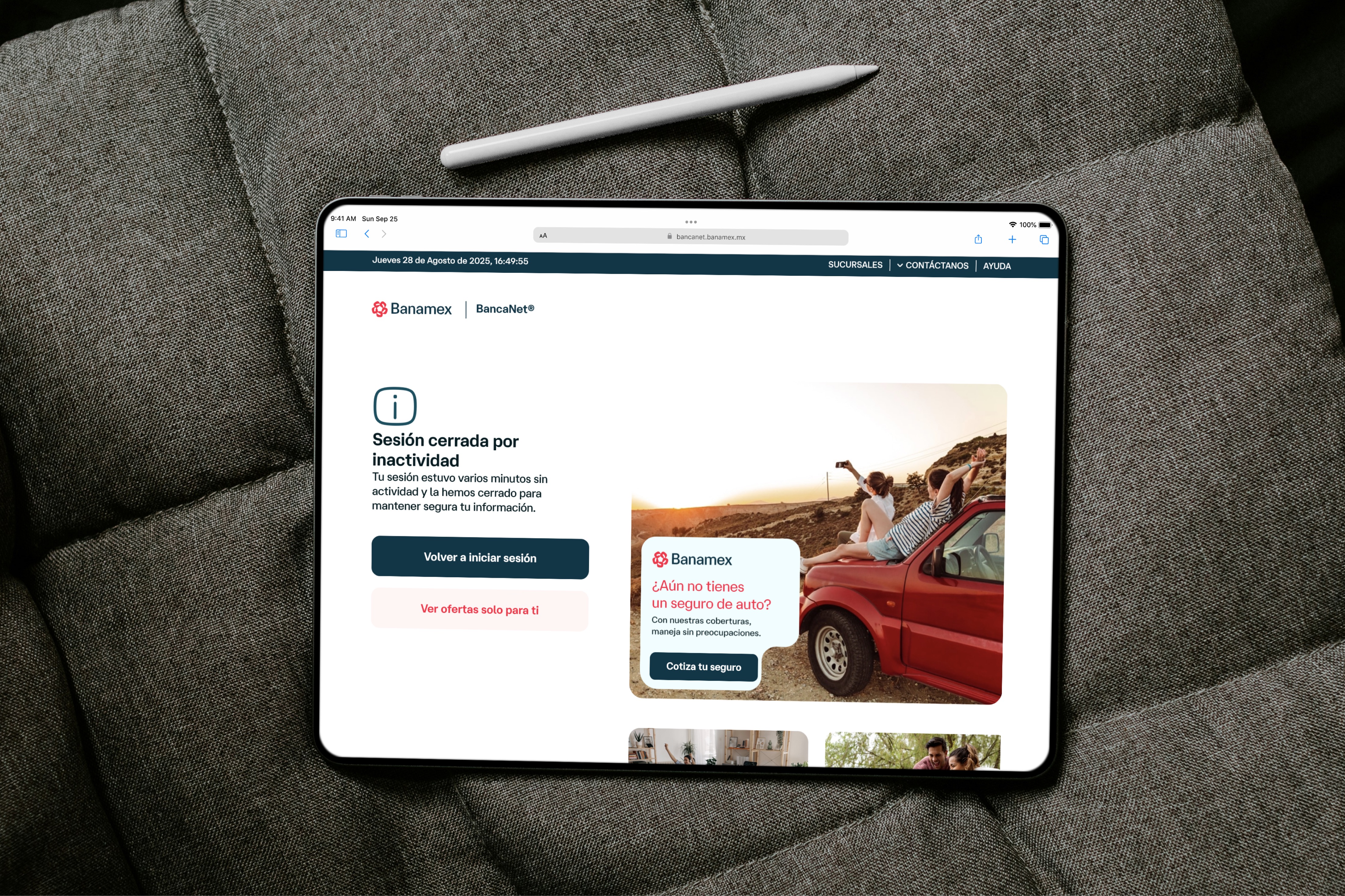
About
Cutting Bill Payments Interaction Cost in Half
A full redesign of Banamex's legacy bill payments flow — from a 12-click ordeal to a 6-click experience that processed 410,000 transactions in its first three months.
- Company
- Banamex
- Role
- Lead Product Designer, Interaction Designer, Prototyper
- Devices
- Mobile App (iOS, Android)
- Duration
- 12 months
OVERVIEW
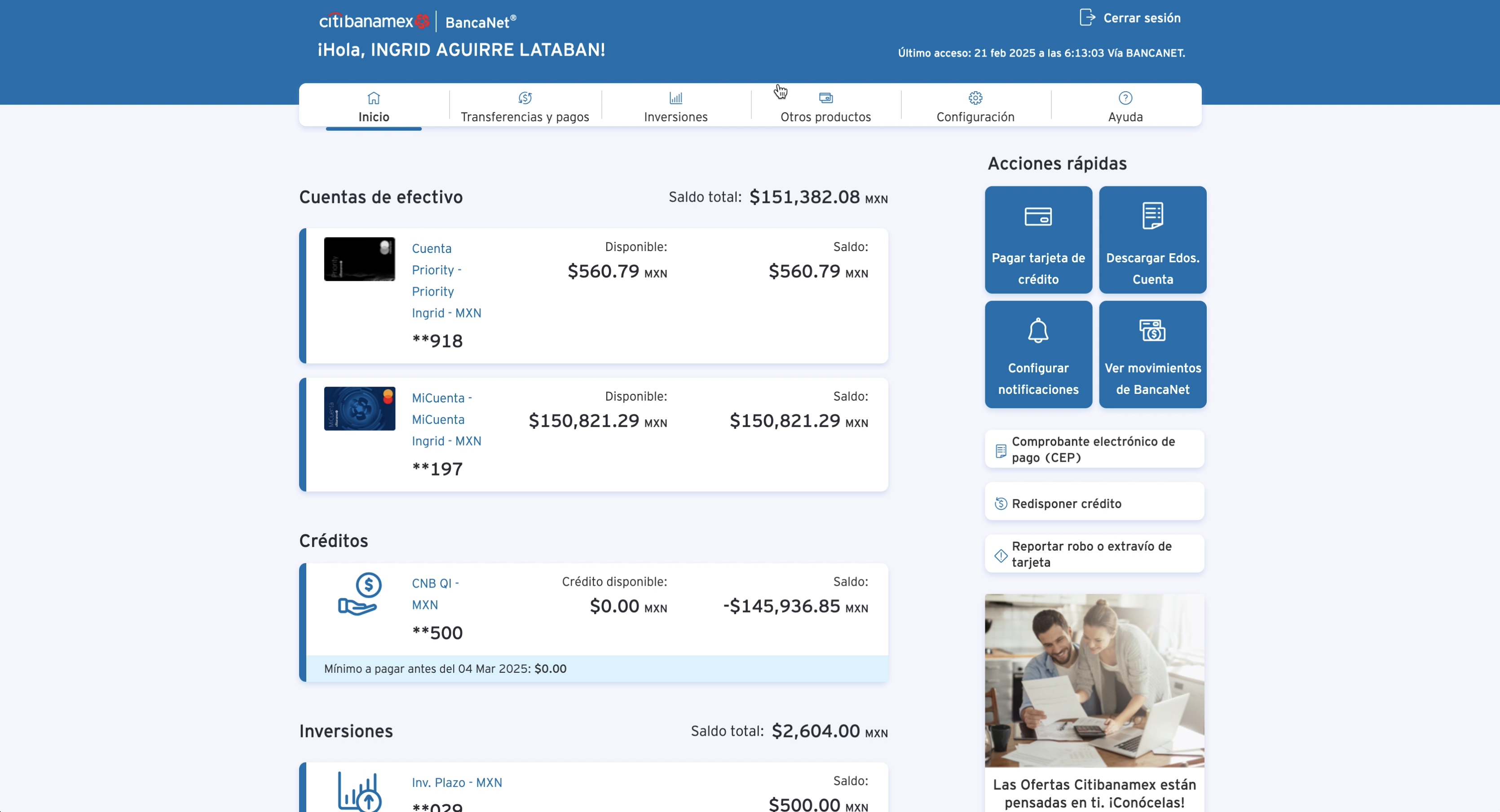
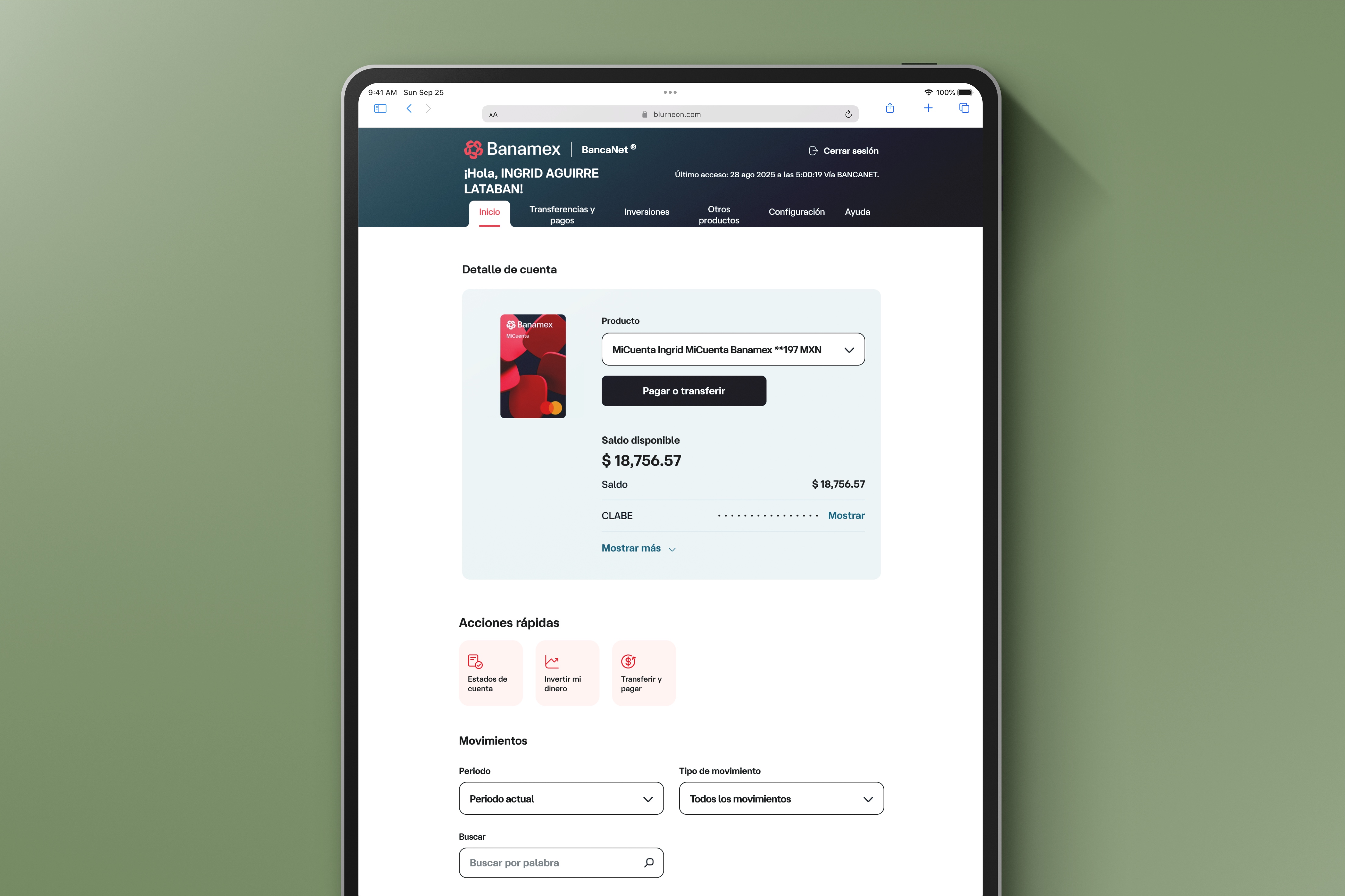
Banamex serves 20 million users.
Their bill payment flow hadn't kept up.
In 2023, I led the end-to-end redesign of this feature as the sole product designer — from stakeholder conversations through discovery, prototyping, and final implementation — in close collaboration with design, product, analytics, development, and legal teams.
PROBLEMS
Three compounding problems, one broken experience.
🗂️
A disorganized biller catalog:
The service catalog was limited in scope and had no logical hierarchy. Searching for a biller was confusing, with no categorization and a poor search experience.
🔁
Excessive interaction cost:
The existing flow required ~12 clicks to complete a payment, riddled with redundant screens and repetitive information that slowed users down and created confusion.
⏰
No support for recurring payments
Users frequently forgot payment due dates, resulting in late fees. There was nowhere to save services, no reminders, and no way to quickly repeat a previous payment — forcing users to restart the flow from scratch every time.
SOLUTION
Key features create one coherent experience.
We introduced features built around a single goal: make bill payments faster, clearer, and less error-prone.

One-time payment
Banamex was migrating to Arcus by Mastercard, unlocking one-time payments, biller logos, auto-populated amounts, and an expanded catalog. This became the technical foundation the redesign was built around.
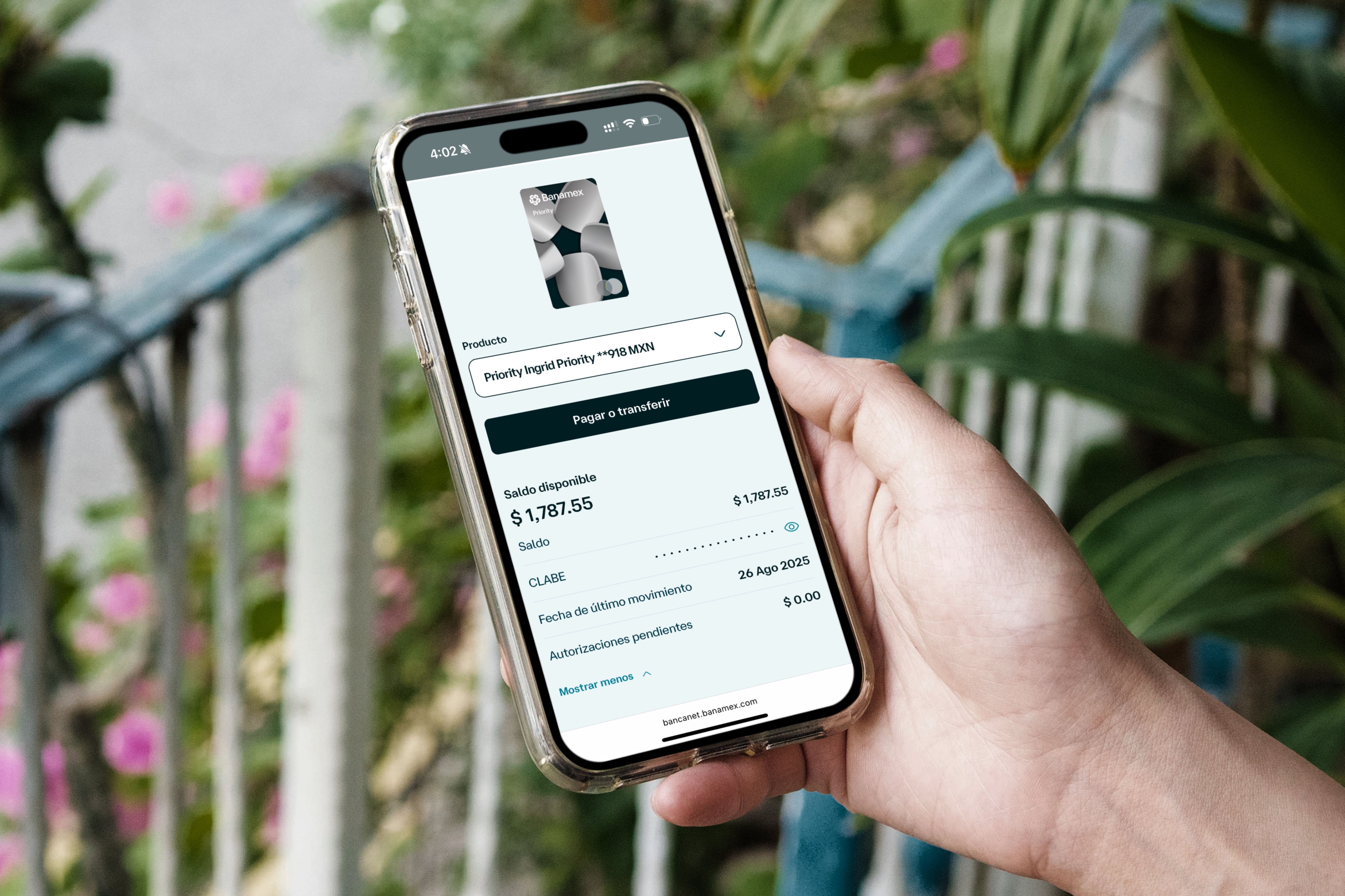
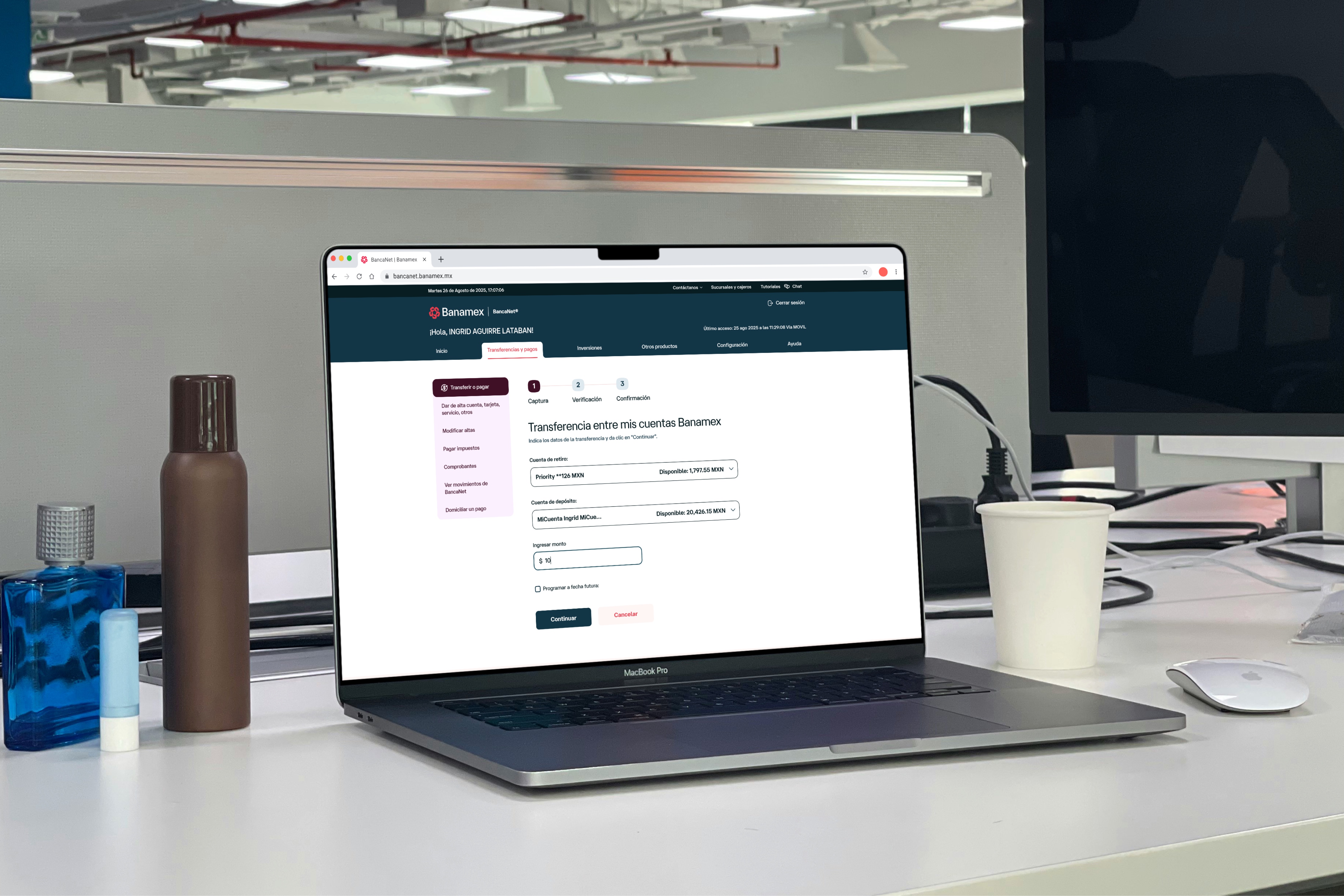
The forced registration step is gone. Pay a bill in six clicks — down from twelve — in under a minute.
QR / Barcode scanning
Scan a receipt to auto-fetch the reference number and payment amount — eliminating the primary source of manual entry errors.

Biller catalog with smart search
Scan a receipt to auto-fetch the reference number and payment amount — eliminating the primary source of manual entry errors.
Saved services hub
All recurring billers in one place, with custom aliases and parametric badges showing days until due. Push and SMS reminders close the loop.
Due today
Urgent badge state
3 days left
Push notification sent
7+ days left
Upcoming reminder
DESIGN PROCESS
From research to a shipped product
Discovery
Ideation
Definition
Design
Prototype + Testing
Hand-Off
· User research
· Stakeholder interviews
· Benchmarking
· Heuristics
· Stakeholder interviews
· Benchmarking
· Heuristics
· HMW sessions
· Feature mapping
· Concept sketches
· Feature mapping
· Concept sketches
· Low-fi prototype
· Stakeholder validation
· MVP scoping
· Stakeholder validation
· MVP scoping
· IA
· Components
· High-fidelity
· Prototyping
· Components
· High-fidelity
· Prototyping
· Card sorting
· Usability testing
· Iteration
· Usability testing
· Iteration
· Dev follow-up
· QA
· Launch war room
· QA
· Launch war room
Research and analysis
Friends and family interviews
"There's no need to register a service every time —
it feels like the flow restarts itself."Recurring theme from user research sessions.Other insights:- · High error rate when entering reference numbers manually
- · Confusion navigating first-time flows
- · No way to track payment history
- · Inability to locate their reference number on receipts
- · No saved services or quick-access hub for recurring payments
Competitive analysis
A broad competitive analysis was conducted across direct competitors — traditional banks and neobanks — and indirect competitors — non-banking platforms with bill payment functionality — to identify design patterns, best practices, and market opportunities that could add value to users.
DirectBBVAStrongest overall offering, QR scanning, saved services, reminders, and logos.DirectNu BankNo QR scanning or auto-populated amounts. Clean UX, growing catalog.DirectSantanderBasic catalog and no QR scanning, but strong recurring payment support.DirectScotiabankFunctional but limited, no QR scanning, no reminders, no biller logos.DirectBanco AztecaNo QR scanning. Broad catalog but navigation is dense.InDirectRappiSpeed and in-app payment simplicityUser flow analysis
The existing flow required ~12 taps to complete a single payment, with several screens duplicating earlier information and a forced registration step that made one-time payments unnecessarily cumbersome.
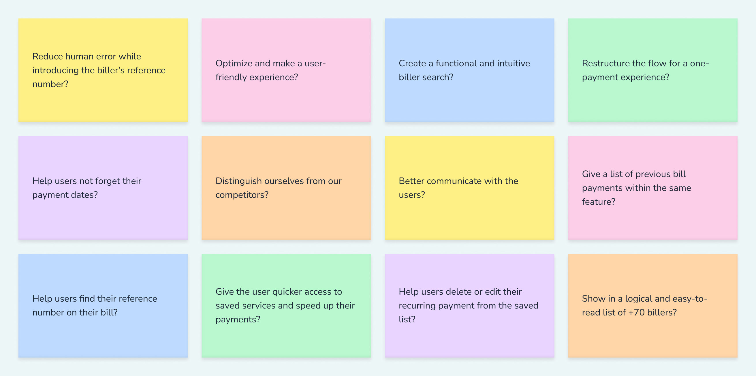
Ideation – How might we...?
Discovery insights were reframed as HMW questions to open up the solution space before any screen was drawn.
H M W
Reduce human error while entering the biller's reference number?
Reduce human error while entering the biller's reference number?
H M W
Restructure the flow for a one-payment experience?
Restructure the flow for a one-payment experience?
H M W
Create a functional and intuitive biller search for 70+ services?
Create a functional and intuitive biller search for 70+ services?
H M W
Help users not forget their payment due dates?
Help users not forget their payment due dates?
H M W
Give users quicker access to saved services?
Give users quicker access to saved services?
H M W
Help users find their reference number on their receipt?
Help users find their reference number on their receipt?
Definition – Information Architecture
Redundant screens were removed and the flow restructured around two clear paths: one-time payment and saved services.
Testing – Card Sorting + Usability
Open and closed card sorting (research tool Maze) established the 9-chip catalog hierarchy.
HAND - OFF
The work doesn't stop at handoff
After several iterations and some last minute (very impactful changes to perfectly align with all stakeholders) I handed-off the project and ran a developer walkthrough, documented every user action in an analytics tagging table, joined engineering standups to resolve edge cases in real time, reviewed demo builds for design fidelity, and joined the launch war room on ship day.
Shipping at Banamex's scale means the designer stays in the loop until the feature is live and working.
IMPACT
Real numbers, real money, real people
50%
Reduction in interaction cost,
from 12 clicks to 6
from 12 clicks to 6
410K
Successful transactions
in the first 3 months
in the first 3 months
$295M
MXN processed through
the redesigned flow
the redesigned flow
<30s
Time to pay a saved service,
just three taps
just three taps
Strong user adoption and ongoing needs are driving the feature's evolution. Future phases will introduce recurring automatic payments, payment history tracking, and microinteractions to edit or remove saved services.
LEARNINGS
What I learned building this
🔌
API constraints shaped design decisions
Several features were cut because the APIs weren't ready. The lesson: design ambitiously, but document constraints clearly so deprioritized ideas can ship later — and most of them did.
🧩
Early cross-functional buy-in changes everything
Bringing product, engineering, and legal in from the start — not just at review gates — meant fewer late surprises and faster decisions when priorities shifted.
💬
Feedback culture is a design tool
Creating consistent space for peers and managers to critique openly led to stronger iteration.
📏
The handoff is part of the design
The gap between a polished prototype and a pixel-accurate shipped product is real. Staying involved through standups, demos, and the launch war room is what closes it.
Cutting Bill Payments Interaction Cost in Half
A full redesign of Banamex's legacy bill payments flow — from a 12-click ordeal to a 6-click experience that processed 410,000 transactions in its first three months.
- Year
- Banamex
- Role
- Lead Product Designer, Interaction Designer, Prototyper
- Devices
- Mobile App (iOS, Android)
- Design tools
- 12 months
OVERVIEW
A separation from Citibank.
A chance to rebuild everything.
In 2023, I led the end-to-end redesign of this feature as the sole product designer — from stakeholder conversations through discovery, prototyping, and final implementation — in close collaboration with design, product, analytics, development, and legal teams.
PROBLEMS
Three problems that had to be solved before design could begin.
🗂️
A disorganized biller catalog:
The service catalog was limited in scope and had no logical hierarchy. Searching for a biller was confusing, with no categorization and a poor search experience.
🔁
Excessive interaction cost:
The existing flow required ~12 clicks to complete a payment, riddled with redundant screens and repetitive information that slowed users down and created confusion.
⏰
No support for recurring payments
Users frequently forgot payment due dates, resulting in late fees. There was nowhere to save services, no reminders, and no way to quickly repeat a previous payment — forcing users to restart the flow from scratch every time.
SOLUTION
A new design system. A fully rebranded product.
Before & after — the same product, rebuilt
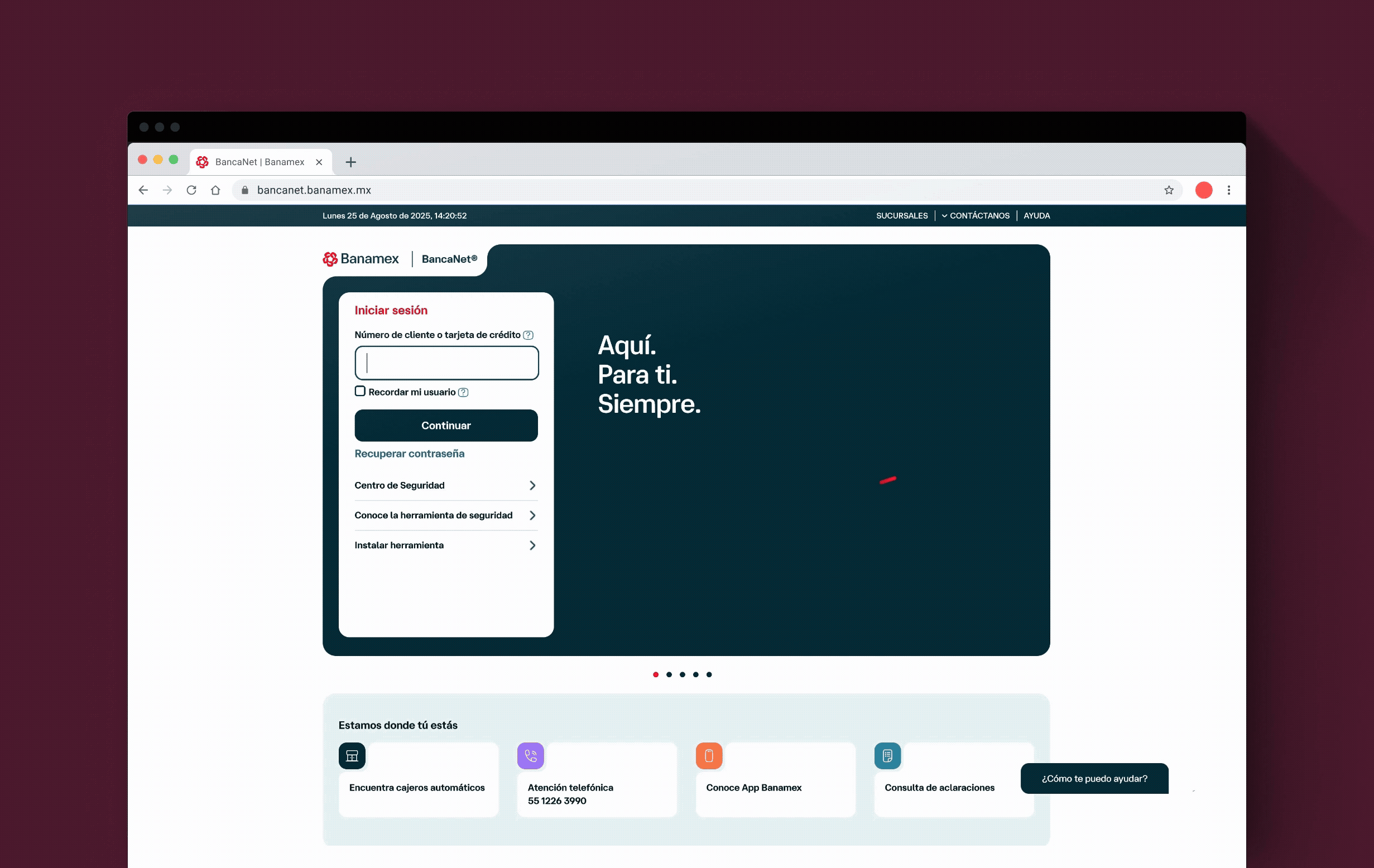
01 · Login
Before
After
The entry point to the new brand — the first screen millions of users see. Redesigned to reflect Banamex's new visual identity from the first interaction.
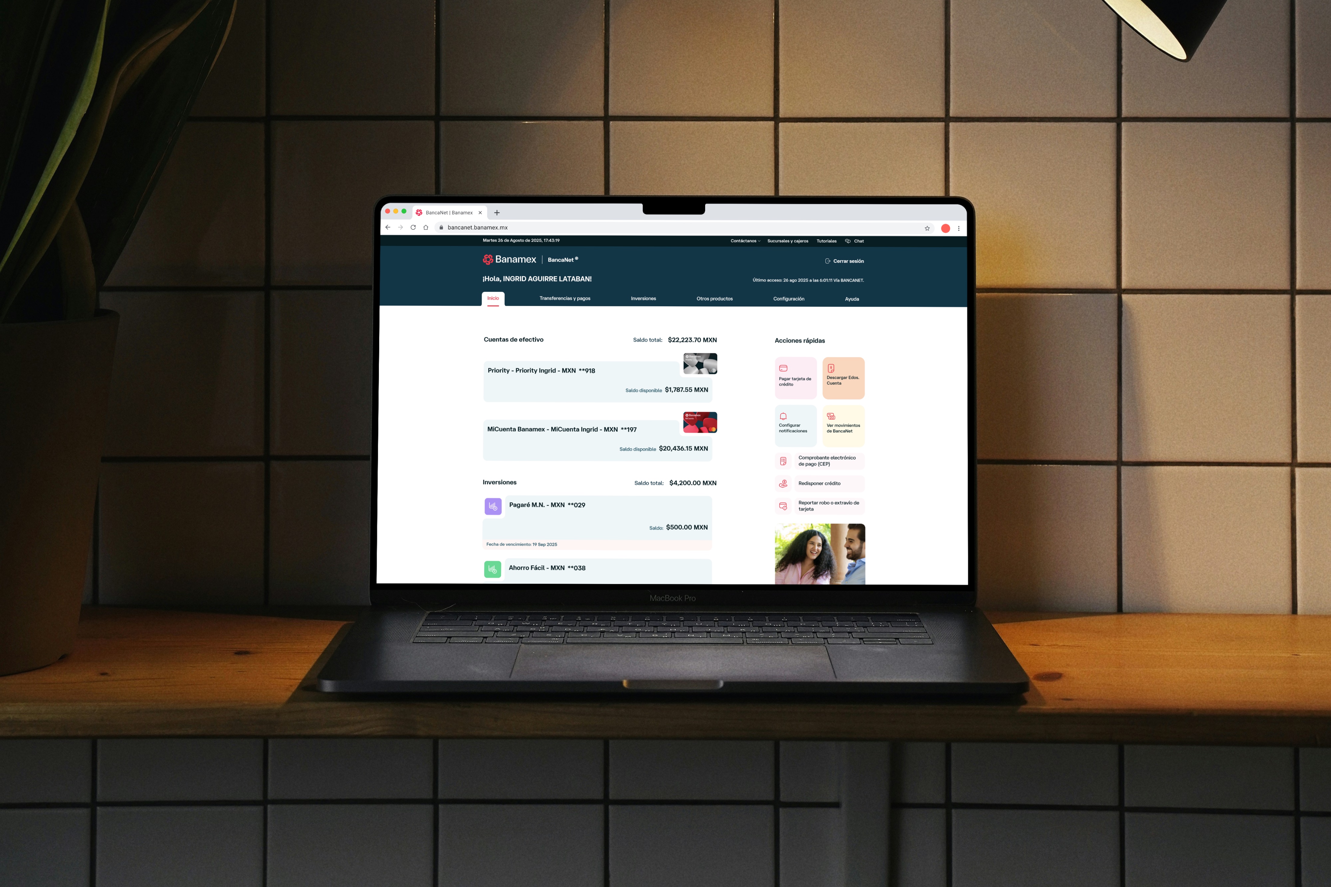
02 · Dashboard
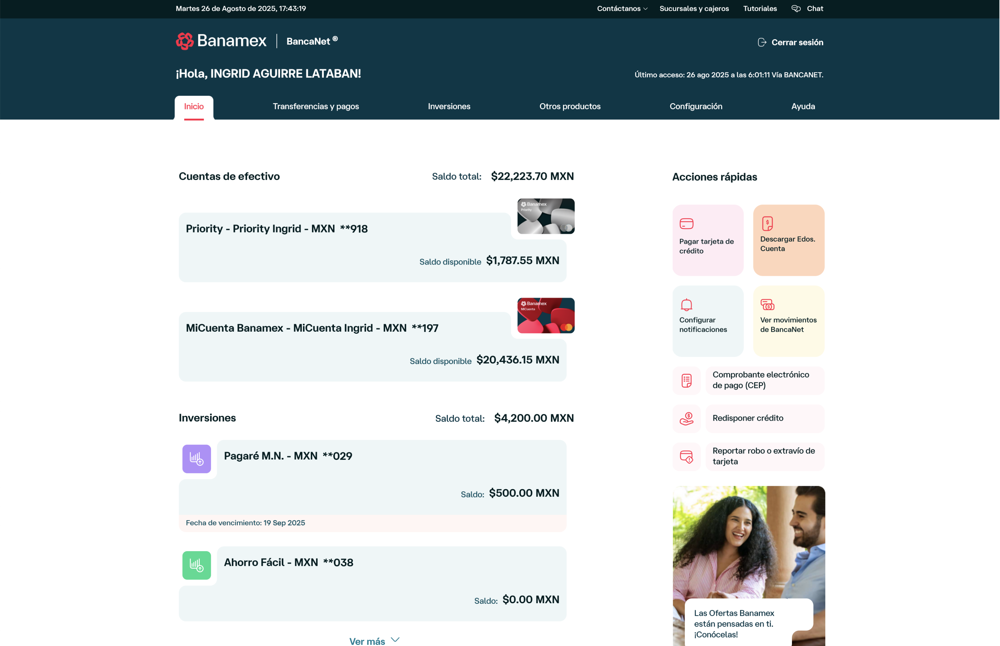
Before
After
The command centre of BancaNet, rebuilt with the new component library to surface account information clearly and consistently across all user types.
03 · Account Detail
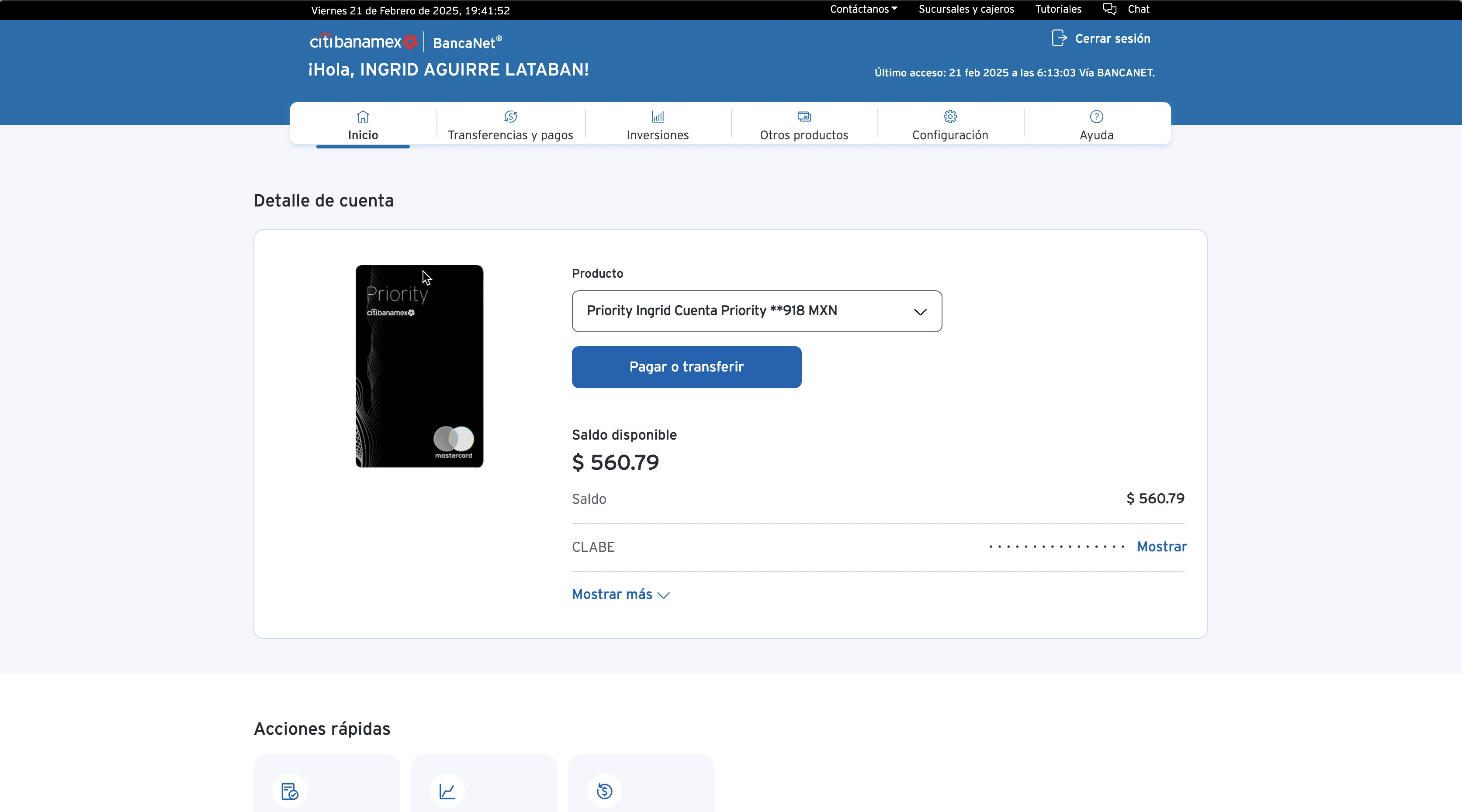
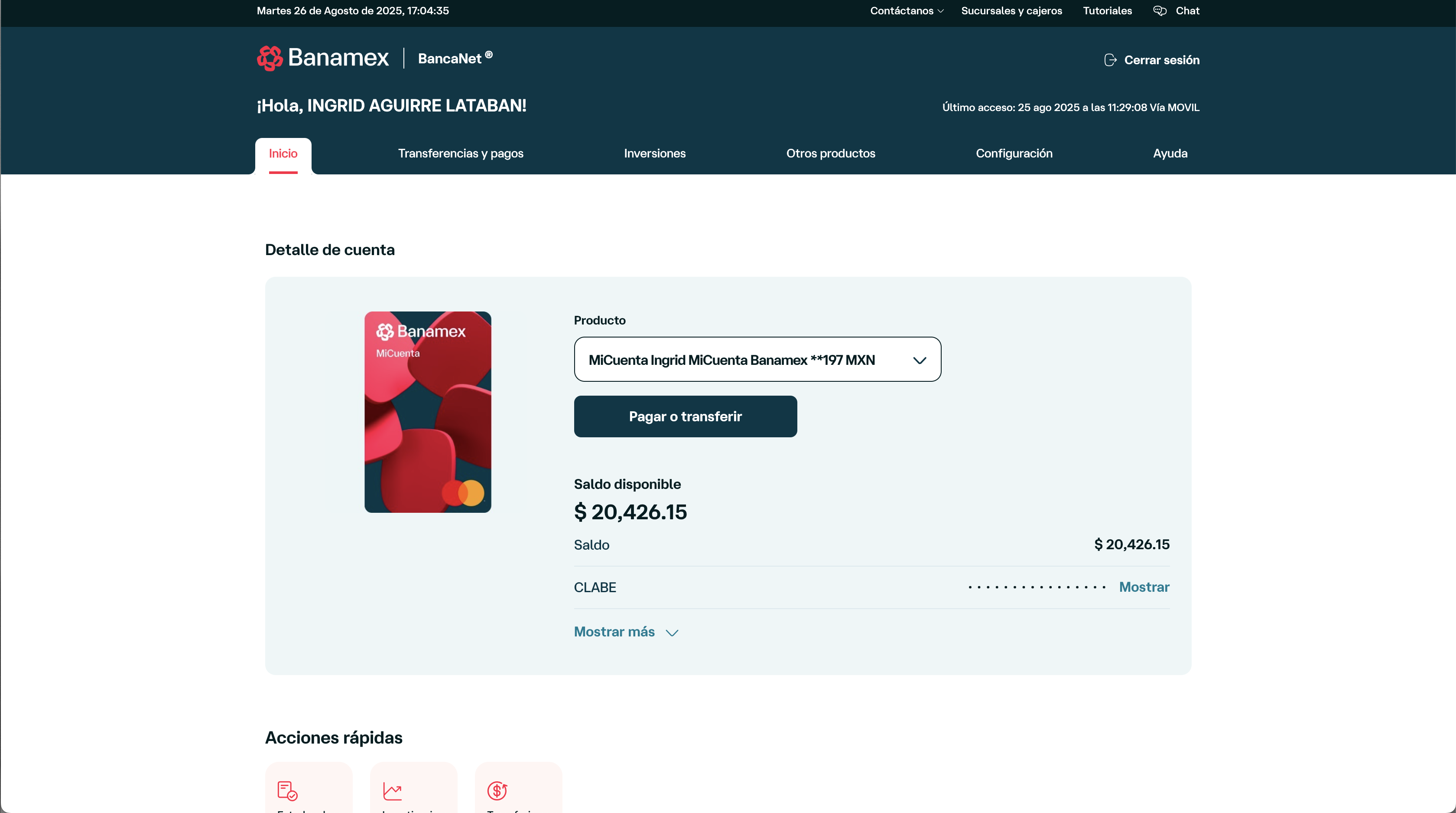
Before
After
A complete reimagining of how users view and manage their accounts — modernised visual hierarchy, updated data display patterns, and full design system compliance.
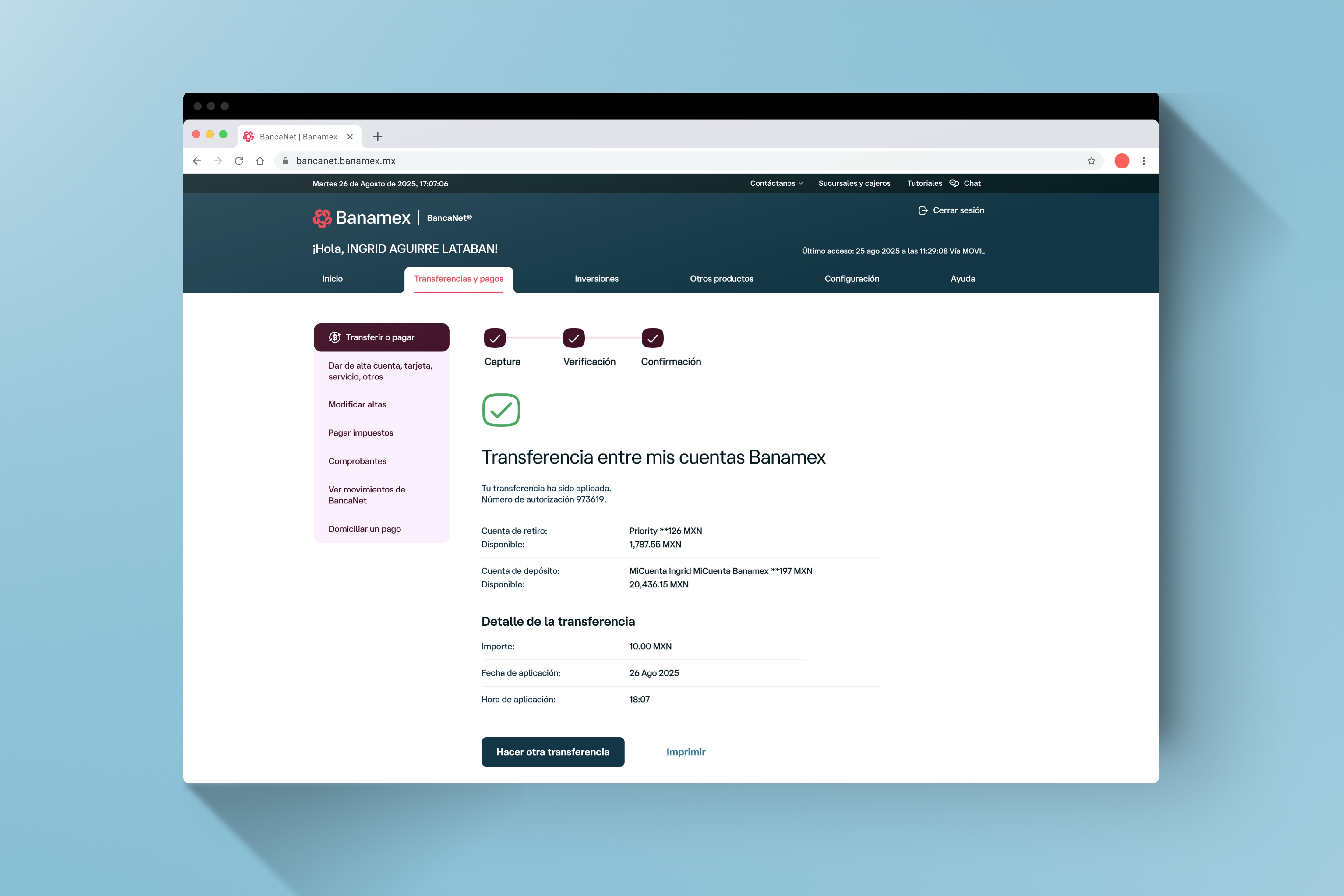
04 · Transfers & payments
Before
After
One of the highest-traffic flows in BancaNet — redesigned for clarity and speed while navigating the technical constraints of legacy transaction infrastructure.
05 · Investments
Before
After
A data-dense feature requiring careful information hierarchy to remain accessible to non-expert users under the new visual system.
06 · Settings & logout

Before
After
Often overlooked, but critical to brand consistency — every corner of BancaNet needed to reflect the new identity, including configuration and session flows.
DESIGN PROCESS
Eight months of parallel workstreams.
Documentation
Design System
UI Iteration
Screen Recration
Hand-off
Launch
· UX audit
· Feature map
· Prioritisation
· Batch planning
· Feature map
· Prioritisation
· Batch planning
· Token architecture
· Atomic components
· Web library
· Atomic components
· Web library
· Strategic screens
· Templates
· Approval process
· Templates
· Approval process
· 7-designer team
· 200+ screens + Responsiveness
· 200+ screens + Responsiveness
· Staged batches
· Dev follow-up
· QA sessions
· Dev follow-up
· QA sessions
· Pre-prod review
· Fix Inconsistencies
· Ship day
· Fix Inconsistencies
· Ship day
Before designing anything, the product had to be found.
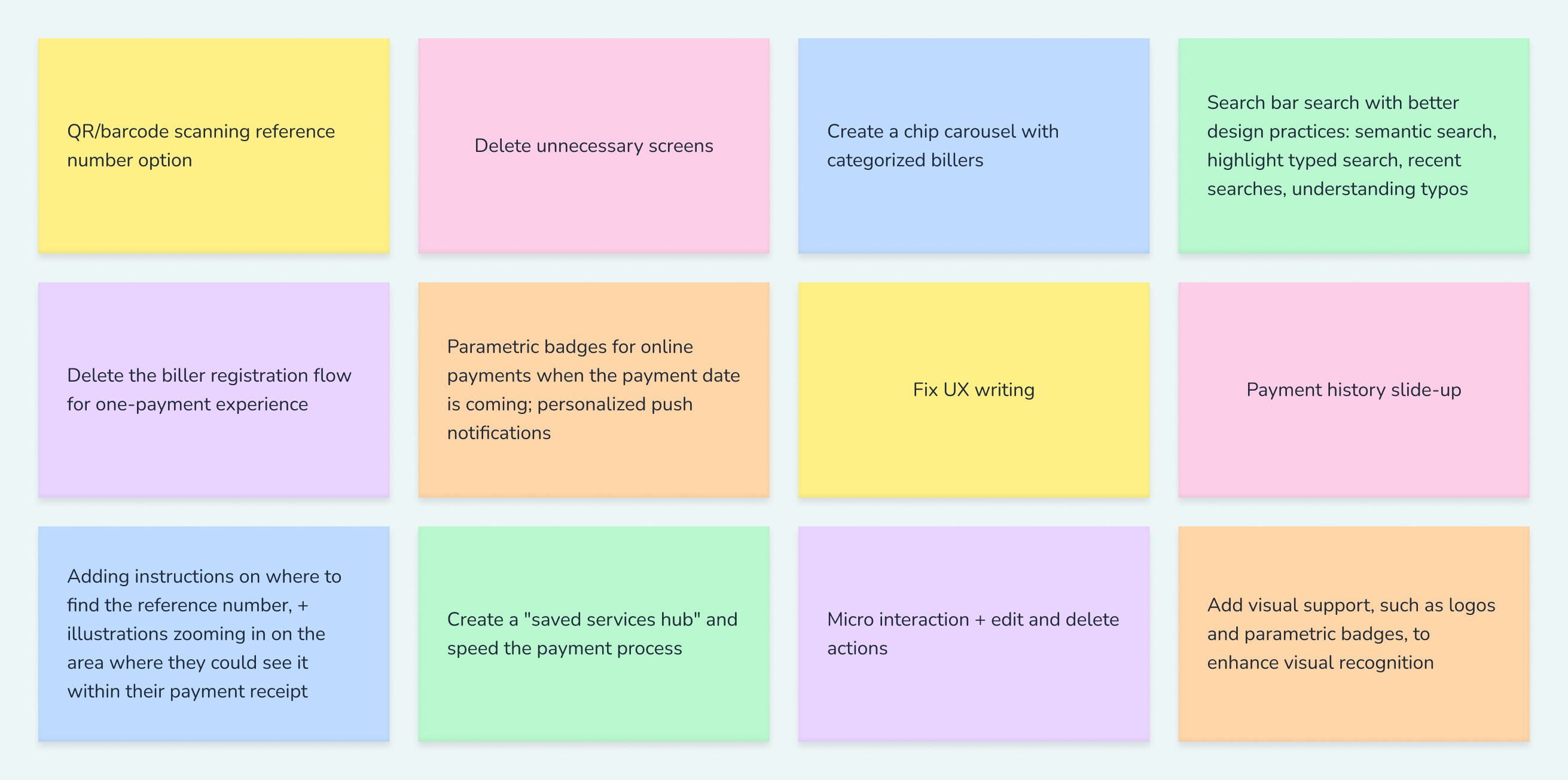
One-time payments removed the forced registration step, cutting the flow from 12 clicks to 6. A QR and barcode scanner auto-fetches reference numbers and amounts, eliminating the most common source of manual errors. An expanded biller catalog — organized by a card-sort-validated 9-chip hierarchy and biller logos — makes finding a service fast and intuitive. The saved services hub consolidates recurring billers in one place, with parametric badges and push reminders so users never miss a due date. A payment history slide-up gives users a running log of past transactions. And contextual instructions help users locate their reference number at the exact moment they need it.
Building the Roseta Design System for web
UI iteration & design approval
Benchmark/Competitor/heuristics analysis
Screen recreation at scale
Current experience analysis:
- information architecture of current flow
Staged handoff & developer follow-up
After analysing the discovery insights, came the moment for ideation, “how might we…” triggering questions helped the most for this process:
How might we…
Launch
New features and enhancements:
IMPACT
On schedule. At scale. Built to last.
5
Web applications rebranded with the Roseta Design System
40+
User flows redesigned across BancaNet
172+
New components — now the standard for all future web development
40%
Faster screen recreation through structured templates and system
DESIGN PROCESS
What leading this project taught me.
🔌
Invest upfront in stakeholder alignment
The approval process involved four distinct stakeholder groups with different priorities. Time spent aligning them early — through the right channels, with the right people in the room — paid back in faster decisions later.
🧩
Documentation is a design deliverable
Starting from nothing taught me that a living source of truth is as important as the screens themselves. The audit I built from scratch became the foundation the entire project ran on.
💬
Done is better than perfect — with evidence
Not everything could be resolved before launch. Accepting that — while documenting what remained — meant the team shipped on time and the inconsistencies file gave engineering a clear, prioritised path forward.
📏
Constraints are creative inputs
Legacy systems forced closer collaboration with developers than a greenfield project would have. That friction produced a more grounded, technically realistic design system — one that actually shipped.


Cutting Bill Payments Interaction Cost in Half
A full redesign of Banamex's legacy bill payments flow — from a 12-click ordeal to a 6-click experience that processed 410,000 transactions in its first three months.
- Company
- Banamex
- Role
- Lead Product Designer, Interaction Designer, Prototyper
- Devices
- Mobile App (iOS, Android)
- Duration
- 12 months
OVERVIEW
Millions of transactions.
One broken moment: "I don't recognize this charge."
In 2023, I led the end-to-end redesign of this feature as the sole product designer — from stakeholder conversations through discovery, prototyping, and final implementation — in close collaboration with design, product, analytics, development, and legal teams.
PROBLEMS
Three compounding problems,
one overloaded support team.
🗂️
A disorganized biller catalog:
The service catalog was limited in scope and had no logical hierarchy. Searching for a biller was confusing, with no categorization and a poor search experience.
🔁
Excessive interaction cost:
The existing flow required ~12 clicks to complete a payment, riddled with redundant screens and repetitive information that slowed users down and created confusion.
⏰
No support for recurring payments
Users frequently forgot payment due dates, resulting in late fees. There was nowhere to save services, no reminders, and no way to quickly repeat a previous payment — forcing users to restart the flow from scratch every time.
In other words...
77%
of customers struggle to identify their own transactions in the app.
73%
choose to call the CAT when unsure about a charge.
1 in 4
CAT calls about unrecognized charges end in confusion — not actual fraud.
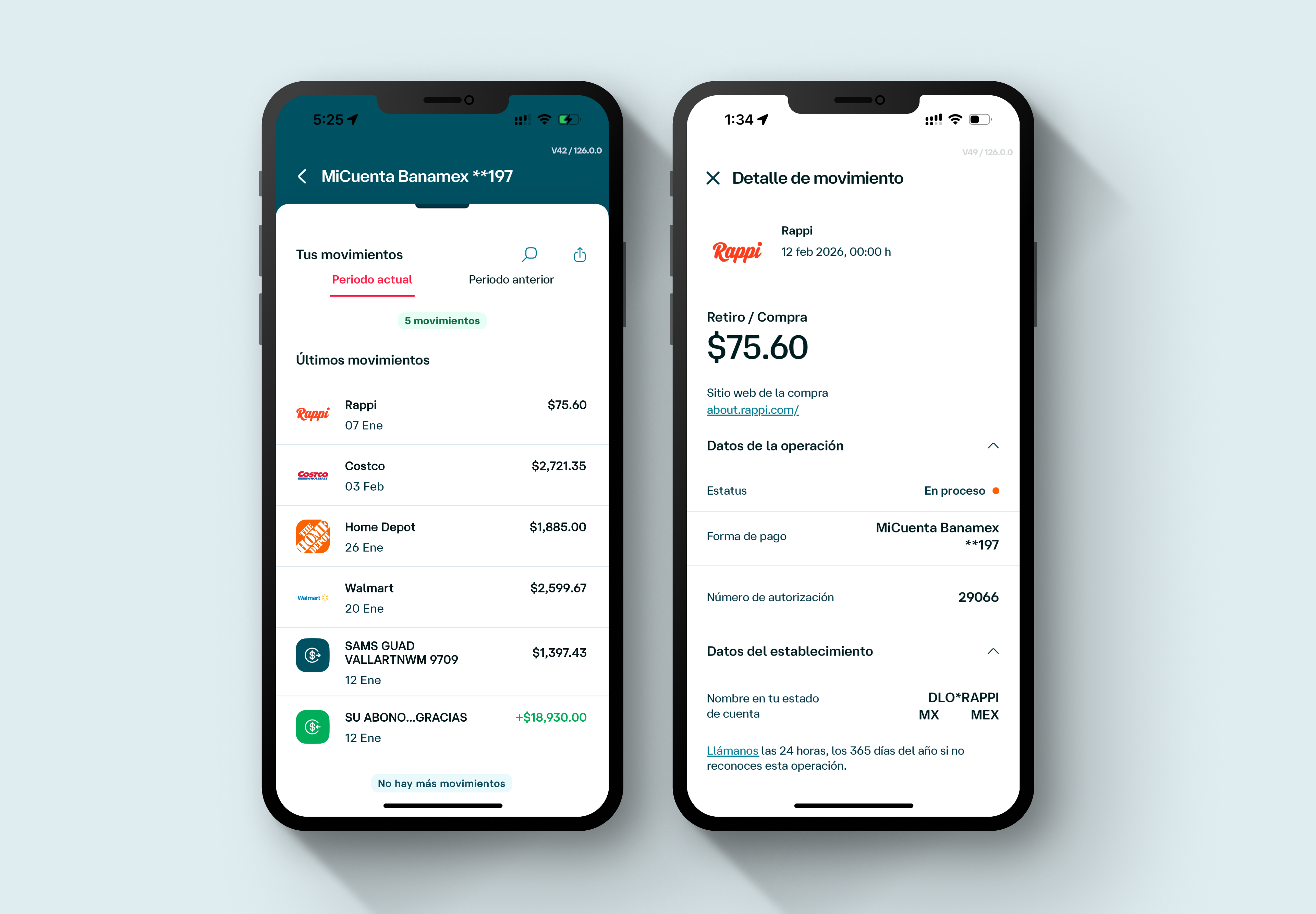
Current state when the project kicked off — no merchant context, no visual anchors, no way to self-resolve.
SOLUTION
Information that turns a mystery charge,
into a recognizable purchase.
One-time payments removed the forced registration step, cutting the flow from 12 clicks to 6. A QR and barcode scanner auto-fetches reference numbers and amounts, eliminating the most common source of manual errors. An expanded biller catalog — organized by a card-sort-validated 9-chip hierarchy and biller logos — makes finding a service fast and intuitive. The saved services hub consolidates recurring billers in one place, with parametric badges and push reminders so users never miss a due date. A payment history slide-up gives users a running log of past transactions. And contextual instructions help users locate their reference number at the exact moment they need it.
1️⃣ Merchant Logo
Banamex was migrating to Arcus by Mastercard, unlocking one-time payments, biller logos, auto-populated amounts, and an expanded catalog. This became the technical foundation the redesign was built around.
The forced registration step is gone. Pay a bill in six clicks — down from twelve — in under a minute.
2️⃣ Clean Merchant Name
Scan a receipt to auto-fetch the reference number and payment amount — eliminating the primary source of manual entry errors.
3️⃣ Spend Category
70+ billers organized by a card-sort-validated 9-chip hierarchy. Biller logos reduce cognitive load and accelerate selection.
4️⃣ Location
All recurring billers in one place, with custom aliases and parametric badges showing days until due. Push and SMS reminders close the loop.
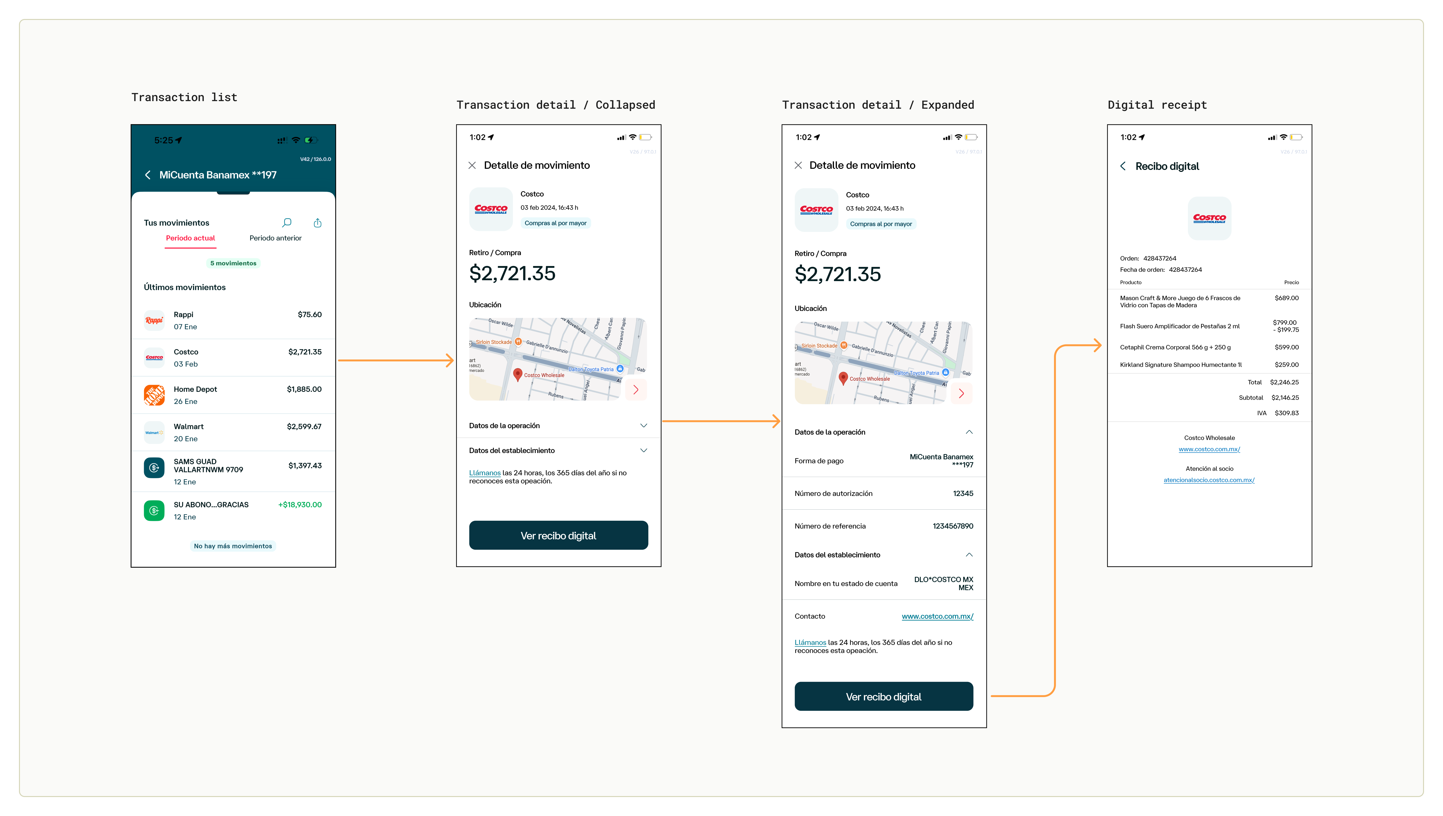
5️⃣ Digital Receipt
Feature 6: Reference number location instructions.
- Payment receipts vary from one another, have too much data, and it gets harder and harder to find the correct reference number or QR/Barcode. To make this process less painful, tap “Where to find reference number?” to see some hints or instructions to find them more easily.
DESIGN PROCESS
From a confusing processor string to
a recognized purchase — in five steps.
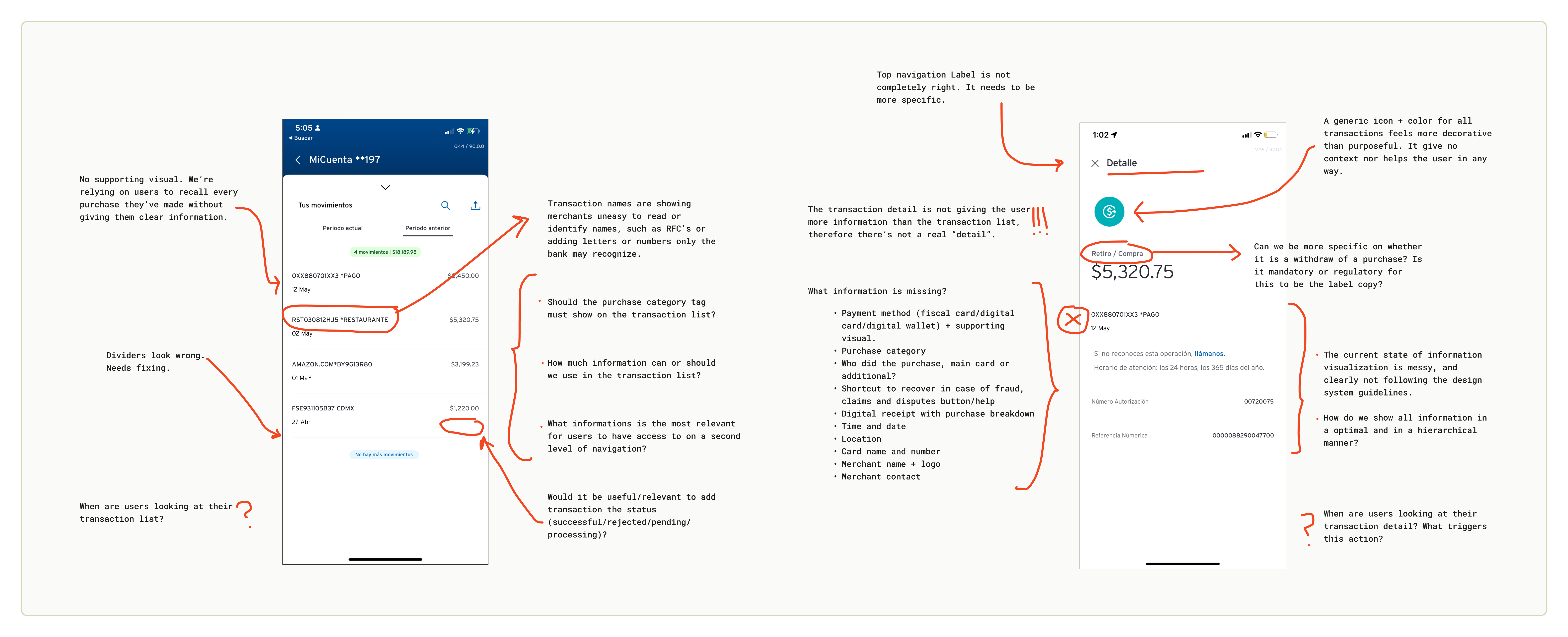
Benchmark — We looked everywhere before drawing anything
We mapped how transaction data was presented across traditional banking apps, international neobanks, and non-banking platforms with strong receipt experiences.
- · Traditional domestic banks provided almost no merchant context.
- · International digital wallets like Apple Pay were richer — but surfacing precise location introduced a cultural nuance: in our market, it could feel intrusive rather than helpful.
- · Apps like Rappi and Amazon showed how a receipt-style view builds confidence without creating anxiety.
Workshop — Five teams. One whiteboard. The first sketches.
We brought together stakeholders from business, acquisition, product, design, and technology teams in a cross-functional Design Thinking oriented workshop. Using sticky notes, iPad sketches, paper wireframes, and dot-voting, teams aligned on which data elements were both technically viable and user-valuable, bringing to the table ideas, concerns, agurments and counter-aguments on how to build an experience that benefits the bank and, of course, the user.
The session produced the first rough sketches of an enriched transaction card — and surfaced critical constraints around what Ethoca's merchant data network could and couldn't provide at launch.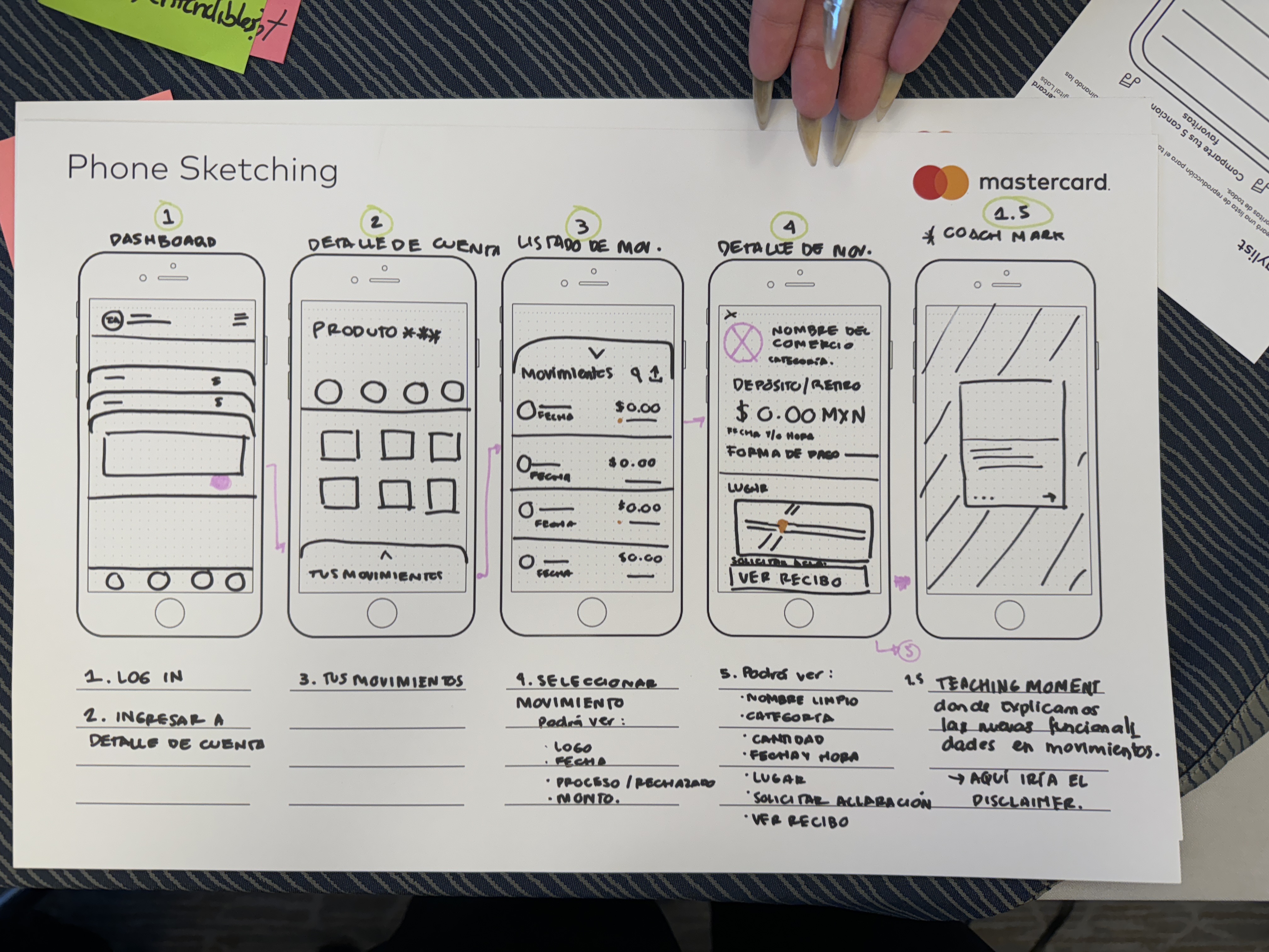
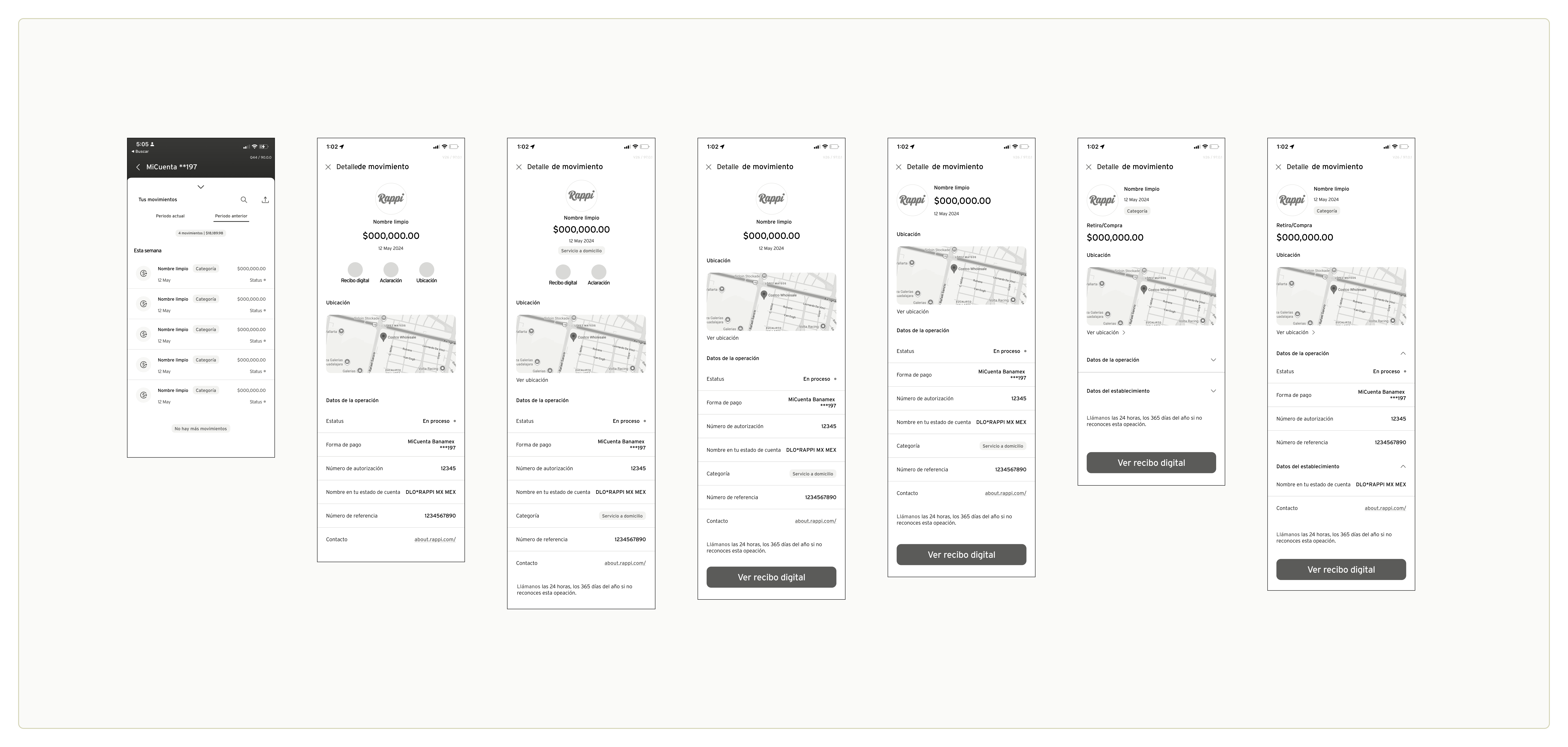
Design explorations
After the workshop we ran multiple design rounds on both the transaction list and tranasction detail screen, exploring different visual hierarchies for the merchant logo, clean name, category, and location.
Use cases — Not all transactions are equal. The design had to handle all of them.
Three distinct use cases shaped the new feature:
User Testing — We put two versions in front of users. The data told us which won.
We ran moderated user testing sessions with three core objectives:
🔀 A/B testing
Baseline (raw string) vs. enriched design, measuring recognition speed and user confidence👁️ Behavioral observation
Understanding what actions users take when they genuinely can't identify a charge📝 Content validation
Testing whether label copy ("Merchant", "Establishment", "Commerce") resonated or created new confusion
MVP
We designed six features. Four made it to launch.
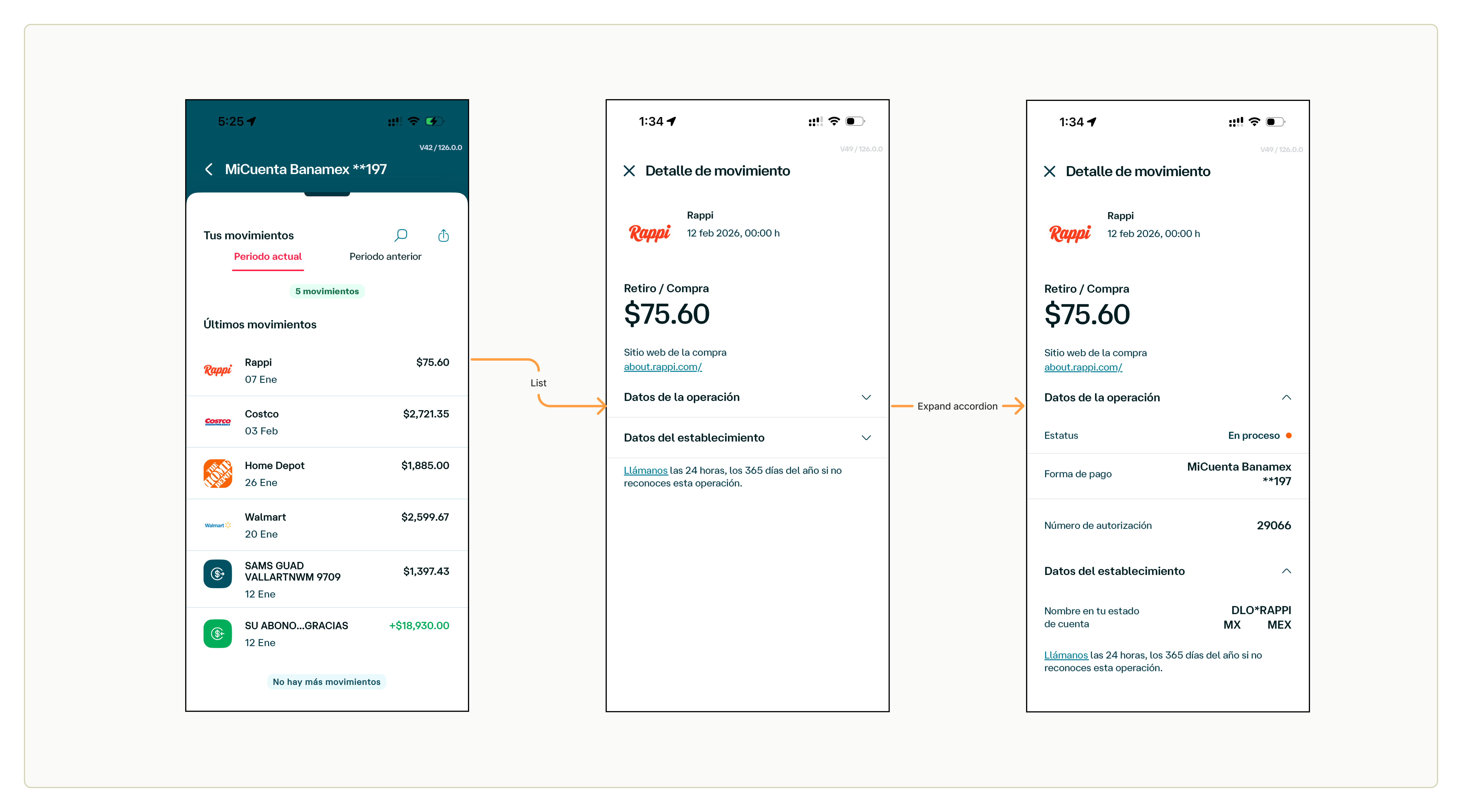
The MVP successfully introduced merchant logos, clean commerce names, merchant contact information, and a redesigned transaction list and detail views — giving users the context to recognize their own purchases without picking up the phone. A real step forward from screens that previously showed nothing but a processor string.
Never the less, the design package was larger, it included three additional features — transaction location, a digital receipt, and spend categories. None of them made it to launch. That's just how shipping works sometimes. The features that didn't make it aren't failures — they're an honest record of how the project evolved and what the team learned along the way.
What didn't ship?
Three features designed.
Three different reasons they didn't launch.
📍 Transaction location
Cut from roadmap
Research surfaced a security concern specific to our market: users worried that location history could expose their movement patterns if their phone was stolen. Unlike international neobanks where this data is standard, it created anxiety rather than confidence. It was removed from the roadmap entirely — the concern wasn't one design iteration could resolve.
🧾 Digital Receipt
Deprioritized — API constraints
During development, the team discovered the Ethoca API had more significant constraints than initially scoped — making itemized receipt data unavailable across all merchant types. With a fixed launch date and limited engineering headcount, a partial solution wasn't viable. The feature was deprioritized with no formal future commitment made at the time.
📂 Spend categories
Dropped — data partner taxonomy
When the Ethoca team shared their category taxonomy, the labels were either too technical for everyday users or exceeded the chip component's character limit. Remapping them to a simpler set would have required additional coordination with the data partner — scope the team couldn't absorb before launch. The feature was dropped rather than ship a confusing or truncated version.
IMPACT
Fewer calls. More confidence.
Support reserved for real problems.
↓ Fewer confusion-driven CAT calls
Contextual merchant data gave users the information to identify charges on their own — eliminating the most preventable source of support volume.
↑ Higher transaction recognition rate
Significantly improved identification in A/B testing compared to the raw-string baseline — users could match transactions to purchases at a glance.
↑ Greater user confidence
Users reported higher peace of mind when reviewing account activity with logos and clean merchant names visible alongside their charges.
→ Real disputes finally surfaced
With confusion filtered out, support contacts increasingly represent genuine fraud cases — improving resolution quality across the board.
LEARNINGS
What I learned building this
🗺️
Sociocultural context is a design constraint
Features that feel neutral in one market can feel intrusive in another. International benchmarks were valuable references — but not templates. Location data that builds trust for a Revolut user raised security concerns for ours. Design has to account for what "normal" means to the specific user, not the general pattern.
🔀
Design for data variability, not just the ideal state
The most important design decision wasn't the enriched view — it was the fallback. When Ethoca data isn't available, the experience still has to feel intentional. Designing the degraded states with the same care as the hero states is what makes a system feel polished at scale.
🧩
Early cross-functional buy-in changes everything
Bringing product, engineering, and external partners in from the workshop stage — not just at review gates — meant fewer surprises when the Ethoca data coverage constraints emerged. Problems discovered together get solved faster.
⌨️
Content is part of the interaction design
Whether to label a merchant as "Commerce", "Merchant", or "Establishment" wasn't a copywriting detail — it was a usability question. The A/B testing revealed that label choice materially affected how users interpreted and trusted the information on screen.
UP